UI / UX Design
Razor Enterprise App Revamp
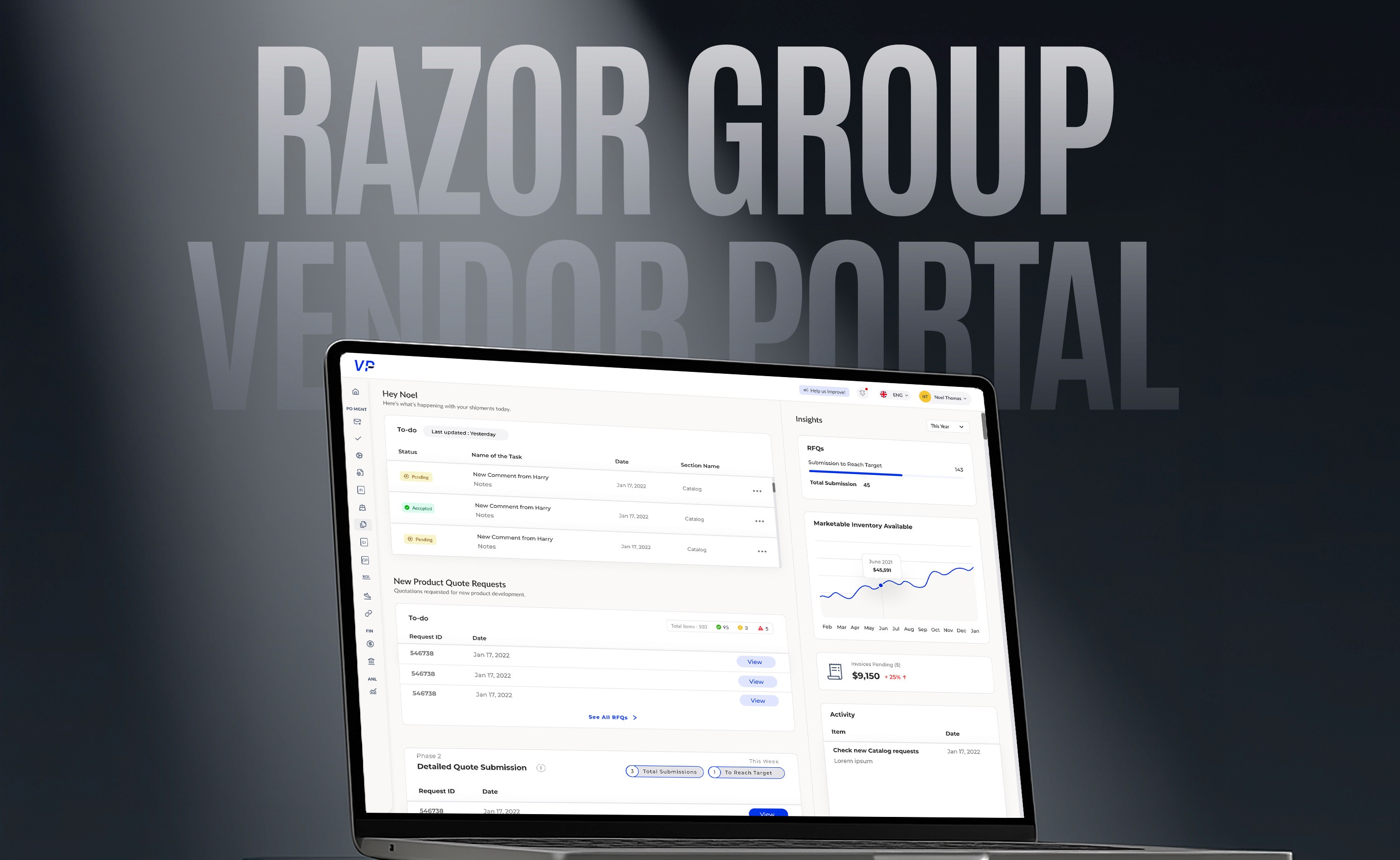
A complete redesign of an enterprise-grade Vendor Portal used by 100+ suppliers, freight forwarders, and internal teams across 3 continents.
Year :
2025
Industry :
E-commerce
Client :
Razor Group GmbH
Project Duration :
10 months


The Brief
Client: Razor Group GmbH
Timeline: Jan 2025 – Oct 2025
My Role: UX Designer
Collaborators: Product Managers, QA, Frontend Developers
Tools: Figma, Confluence, Jira, Notion
The Challenge
The Vendor Portal was functional — but not usable.
Vendors struggled to find what they needed.
Compliance and supply managers wasted hours in document validations.
UX was inconsistent across modules (RFQ, PO, Invoicing, Packaging, Shipments).
The portal needed a redesign grounded in business logic and real workflows, not just new UI components.
Goals
Simplify multi-step workflows like invoice generation, invoice approval and shipment documentation.
Reduce validation time and back-and-forth between teams.
Improve clarity with global search, filters, and contextual UI states.
Introduce notifications & release management modules to the app.


Solution
Research & Audit
Before jumping into pixels, I needed to understand how people actually worked inside the Vendor Portal — and where things broke down.
So, I started by talking to the real users — compliance managers, vendors, and freight teams — to see what a “regular workday” looked like for them.
What I found was eye-opening: every team had their own version of truth, and every workflow had invisible blockers hidden in emails and Excel sheets.
This helped me uncover usability gaps like:
Overloaded tables with unclear statuses
Missing visual hierarchy
Confusing approval paths across roles
Next, I used Notion to map the information architecture of each module — RFQ, PO, Packaging, Invoicing, and Shipments — identifying where users dropped off or duplicated work.
Design Approach
1. Modular, Role-Based Dashboards
Custom views for Vendors, Compliance Managers, Content Teams, and Supply Managers.
2. Context-Aware Tables & Filters
Replaced static tables with dynamic filters, sorting, and inline actions.
3. Unified Design System
Built a new design system in Figma with reusable components, consistent typography, and scalable grids.


Takeaway
The redesign wasn’t just about new layouts — it was about creating clarity, consistency, and control for every user interacting with the system.
Key UX Outcomes:
40% faster task completion: Streamlined workflows and reduced the number of clicks required to upload, review, and approve files.
Improved information hierarchy: Reorganized layouts, labels, and table columns to match how users think — not how data is stored.
Reduced cognitive load: Introduced contextual tooltips, clearer status colors, and “Next / Previous” navigation in review screens.
Higher first-time success rate: Simplified form validations and inline feedback reduced user errors and resubmissions.
Unified experience across modules: A single design language now ties together Packaging, Invoicing, and Shipment modules for smoother navigation.
Accessibility-focused UI: Better color contrast, visual feedback, and responsive layouts improved usability for global teams across time zones and devices.
Reflections
Designing enterprise tools is about empathy for hidden workflows.
What started as a “UI revamp” turned into an operational design overhaul — connecting tech, data, and people in one visual language.


More Projects
UI / UX Design
Razor Enterprise App Revamp
A complete redesign of an enterprise-grade Vendor Portal used by 100+ suppliers, freight forwarders, and internal teams across 3 continents.
Year :
2025
Industry :
E-commerce
Client :
Razor Group GmbH
Project Duration :
10 months


The Brief
Client: Razor Group GmbH
Timeline: Jan 2025 – Oct 2025
My Role: UX Designer
Collaborators: Product Managers, QA, Frontend Developers
Tools: Figma, Confluence, Jira, Notion
The Challenge
The Vendor Portal was functional — but not usable.
Vendors struggled to find what they needed.
Compliance and supply managers wasted hours in document validations.
UX was inconsistent across modules (RFQ, PO, Invoicing, Packaging, Shipments).
The portal needed a redesign grounded in business logic and real workflows, not just new UI components.
Goals
Simplify multi-step workflows like invoice generation, invoice approval and shipment documentation.
Reduce validation time and back-and-forth between teams.
Improve clarity with global search, filters, and contextual UI states.
Introduce notifications & release management modules to the app.


Solution
Research & Audit
Before jumping into pixels, I needed to understand how people actually worked inside the Vendor Portal — and where things broke down.
So, I started by talking to the real users — compliance managers, vendors, and freight teams — to see what a “regular workday” looked like for them.
What I found was eye-opening: every team had their own version of truth, and every workflow had invisible blockers hidden in emails and Excel sheets.
This helped me uncover usability gaps like:
Overloaded tables with unclear statuses
Missing visual hierarchy
Confusing approval paths across roles
Next, I used Notion to map the information architecture of each module — RFQ, PO, Packaging, Invoicing, and Shipments — identifying where users dropped off or duplicated work.
Design Approach
1. Modular, Role-Based Dashboards
Custom views for Vendors, Compliance Managers, Content Teams, and Supply Managers.
2. Context-Aware Tables & Filters
Replaced static tables with dynamic filters, sorting, and inline actions.
3. Unified Design System
Built a new design system in Figma with reusable components, consistent typography, and scalable grids.


Takeaway
The redesign wasn’t just about new layouts — it was about creating clarity, consistency, and control for every user interacting with the system.
Key UX Outcomes:
40% faster task completion: Streamlined workflows and reduced the number of clicks required to upload, review, and approve files.
Improved information hierarchy: Reorganized layouts, labels, and table columns to match how users think — not how data is stored.
Reduced cognitive load: Introduced contextual tooltips, clearer status colors, and “Next / Previous” navigation in review screens.
Higher first-time success rate: Simplified form validations and inline feedback reduced user errors and resubmissions.
Unified experience across modules: A single design language now ties together Packaging, Invoicing, and Shipment modules for smoother navigation.
Accessibility-focused UI: Better color contrast, visual feedback, and responsive layouts improved usability for global teams across time zones and devices.
Reflections
Designing enterprise tools is about empathy for hidden workflows.
What started as a “UI revamp” turned into an operational design overhaul — connecting tech, data, and people in one visual language.


More Projects
UI / UX Design
Razor Enterprise App Revamp
A complete redesign of an enterprise-grade Vendor Portal used by 100+ suppliers, freight forwarders, and internal teams across 3 continents.
Year :
2025
Industry :
E-commerce
Client :
Razor Group GmbH
Project Duration :
10 months


The Brief
Client: Razor Group GmbH
Timeline: Jan 2025 – Oct 2025
My Role: UX Designer
Collaborators: Product Managers, QA, Frontend Developers
Tools: Figma, Confluence, Jira, Notion
The Challenge
The Vendor Portal was functional — but not usable.
Vendors struggled to find what they needed.
Compliance and supply managers wasted hours in document validations.
UX was inconsistent across modules (RFQ, PO, Invoicing, Packaging, Shipments).
The portal needed a redesign grounded in business logic and real workflows, not just new UI components.
Goals
Simplify multi-step workflows like invoice generation, invoice approval and shipment documentation.
Reduce validation time and back-and-forth between teams.
Improve clarity with global search, filters, and contextual UI states.
Introduce notifications & release management modules to the app.


Solution
Research & Audit
Before jumping into pixels, I needed to understand how people actually worked inside the Vendor Portal — and where things broke down.
So, I started by talking to the real users — compliance managers, vendors, and freight teams — to see what a “regular workday” looked like for them.
What I found was eye-opening: every team had their own version of truth, and every workflow had invisible blockers hidden in emails and Excel sheets.
This helped me uncover usability gaps like:
Overloaded tables with unclear statuses
Missing visual hierarchy
Confusing approval paths across roles
Next, I used Notion to map the information architecture of each module — RFQ, PO, Packaging, Invoicing, and Shipments — identifying where users dropped off or duplicated work.
Design Approach
1. Modular, Role-Based Dashboards
Custom views for Vendors, Compliance Managers, Content Teams, and Supply Managers.
2. Context-Aware Tables & Filters
Replaced static tables with dynamic filters, sorting, and inline actions.
3. Unified Design System
Built a new design system in Figma with reusable components, consistent typography, and scalable grids.


Takeaway
The redesign wasn’t just about new layouts — it was about creating clarity, consistency, and control for every user interacting with the system.
Key UX Outcomes:
40% faster task completion: Streamlined workflows and reduced the number of clicks required to upload, review, and approve files.
Improved information hierarchy: Reorganized layouts, labels, and table columns to match how users think — not how data is stored.
Reduced cognitive load: Introduced contextual tooltips, clearer status colors, and “Next / Previous” navigation in review screens.
Higher first-time success rate: Simplified form validations and inline feedback reduced user errors and resubmissions.
Unified experience across modules: A single design language now ties together Packaging, Invoicing, and Shipment modules for smoother navigation.
Accessibility-focused UI: Better color contrast, visual feedback, and responsive layouts improved usability for global teams across time zones and devices.
Reflections
Designing enterprise tools is about empathy for hidden workflows.
What started as a “UI revamp” turned into an operational design overhaul — connecting tech, data, and people in one visual language.


