
Web Design
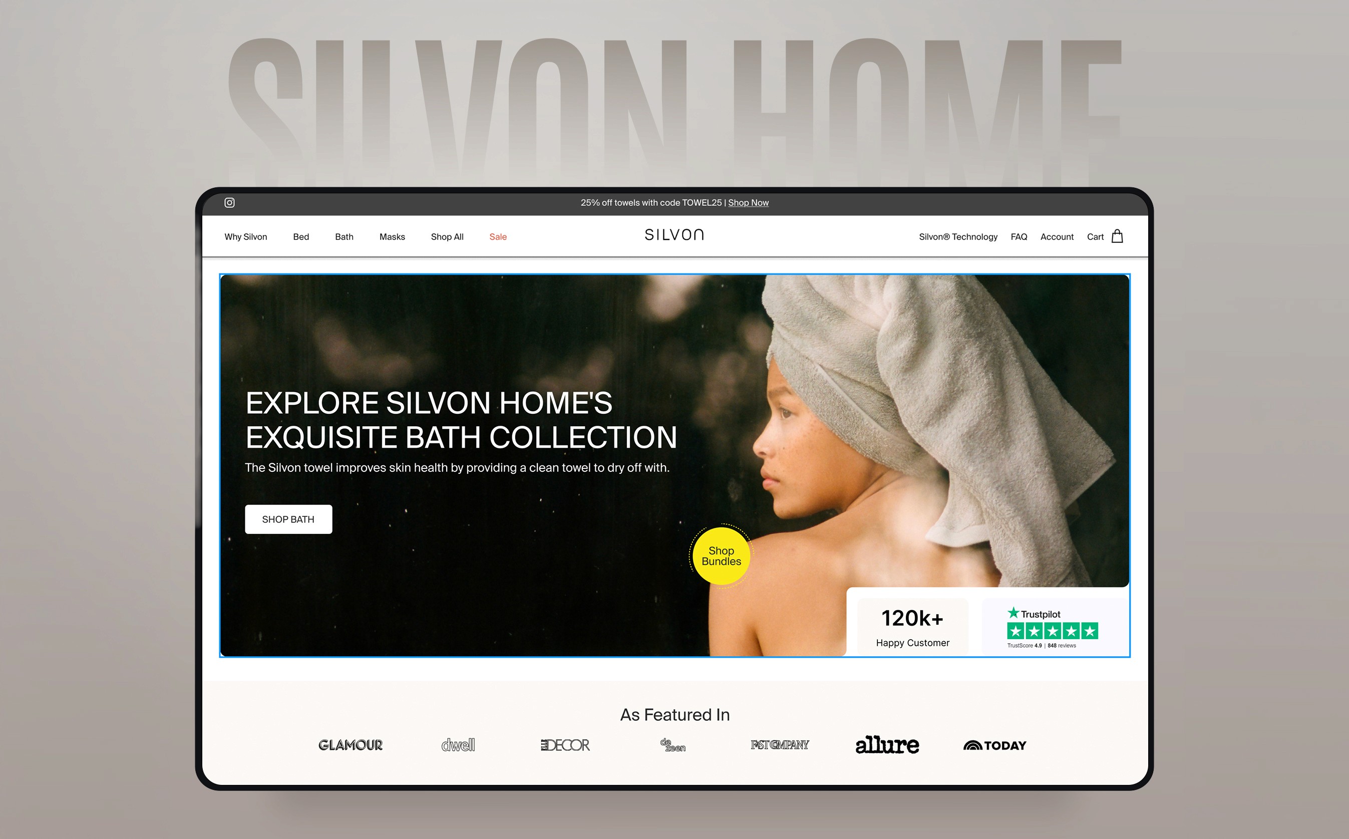
Silvon D2C Website Redesign
A soft, breathable, conversion-first redesign for a modern home & living brand.
Year :
2023
Industry :
Home & Living
Client :
Silvon USA
Project Duration :
5 weeks
The Challenge
Silvon Home sells antimicrobial bedding made with natural silver — premium, science-backed, dermatologist-recommended.
But their old website? It didn’t feel premium, it didn’t tell the story, and it definitely didn’t sell the experience. So I redesigned their entire D2C website to match the brand’s personality: clean, calm, and quietly luxurious… while also fixing the UX & conversion issues hiding underneath.
The old homepage had three major issues:
Weak storytelling — Product first, value second. No narrative.
Low perceived premium value — Design didn’t match the product quality.
Overcrowded layout — Too many mixed messages, no visual hierarchy.
Trust markers buried — Science, reviews, and before/after results weren’t highlighted.
No guided shopping flow — Users didn’t know where to start or why Silvon is different.
Design Direction
Silvon feels like a Sunday morning brand.
Soft, warm, calm — but not sleepy. Editorial, but still practical.
So the design direction leaned towards:
Muted neutrals to reflect calmness
Minimal typography that lets photography breathe
Generous whitespace to evoke softness
Lifestyle imagery instead of sterile product placement
Modular grids that can scale easily across product launches
Client wanted the experience to feel like walking into a cozy boutique — soothing, trustworthy, and premium.

Before v/s After
A quick scroll tells the story:
The old homepage felt product-heavy but emotionally light.
The visuals didn’t match the softness & science the brand is built on.
And most importantly — there wasn’t a clear story that guides a new user toward trust → interest → purchase.
My redesign focused on flow, clarity, breathing space, and trusted cues that make a shopper feel,
“Okay, this brand gets me… and this looks worth paying for.”


Final Takeaway
Premium D2C brands win through emotion + trust.
The redesigned Silvon homepage is built on both — a calm, soft visual story supported by science-backed proof.
While this was a design-focused project, the improvements directly impact:
Higher trust → better conversion potential - Clear proof early in the page builds confidence.
Stronger brand perception - Feels premium → supports higher pricing.
Better discoverability - Best-sellers placed exactly where users expect them.
Simpler user journey - One narrative = fewer drop-offs.
Mobile usability - Spacious layout → better readability → fewer rage scrolls.
Below are mobile designs for homepage and product description page.


More Projects
Web Design
Silvon D2C Website Redesign
A soft, breathable, conversion-first redesign for a modern home & living brand.
Year :
2023
Industry :
Home & Living
Client :
Silvon USA
Project Duration :
5 weeks
The Challenge
Silvon Home sells antimicrobial bedding made with natural silver — premium, science-backed, dermatologist-recommended.
But their old website? It didn’t feel premium, it didn’t tell the story, and it definitely didn’t sell the experience. So I redesigned their entire D2C website to match the brand’s personality: clean, calm, and quietly luxurious… while also fixing the UX & conversion issues hiding underneath.
The old homepage had three major issues:
Weak storytelling — Product first, value second. No narrative.
Low perceived premium value — Design didn’t match the product quality.
Overcrowded layout — Too many mixed messages, no visual hierarchy.
Trust markers buried — Science, reviews, and before/after results weren’t highlighted.
No guided shopping flow — Users didn’t know where to start or why Silvon is different.
Design Direction
Silvon feels like a Sunday morning brand.
Soft, warm, calm — but not sleepy. Editorial, but still practical.
So the design direction leaned towards:
Muted neutrals to reflect calmness
Minimal typography that lets photography breathe
Generous whitespace to evoke softness
Lifestyle imagery instead of sterile product placement
Modular grids that can scale easily across product launches
Client wanted the experience to feel like walking into a cozy boutique — soothing, trustworthy, and premium.
Before v/s After
A quick scroll tells the story:
The old homepage felt product-heavy but emotionally light.
The visuals didn’t match the softness & science the brand is built on.
And most importantly — there wasn’t a clear story that guides a new user toward trust → interest → purchase.
My redesign focused on flow, clarity, breathing space, and trusted cues that make a shopper feel,
“Okay, this brand gets me… and this looks worth paying for.”
Final Takeaway
Premium D2C brands win through emotion + trust.
The redesigned Silvon homepage is built on both — a calm, soft visual story supported by science-backed proof.
While this was a design-focused project, the improvements directly impact:
Higher trust → better conversion potential - Clear proof early in the page builds confidence.
Stronger brand perception - Feels premium → supports higher pricing.
Better discoverability - Best-sellers placed exactly where users expect them.
Simpler user journey - One narrative = fewer drop-offs.
Mobile usability - Spacious layout → better readability → fewer rage scrolls.
Below are mobile designs for homepage and product description page.